Experian for Business
Five components I designed for experian.com/business, the research behind each one, and how I’d take them further today.
Dozens of products, hundreds of pages, and one header trying to hold them together.
Experian’s business site is assembled by marketing teams across the company from shared Adobe Experience Manager components. On the Shared Marketing team I designed those components and the navigation around them, and I tested them with the people who use the site.
This case study follows five of them: the page before, the design I shipped or proposed, the research that shaped it, and a working version you can try. The working versions are concepts I built later to take each design further.
Three navigations on one page and no front door.
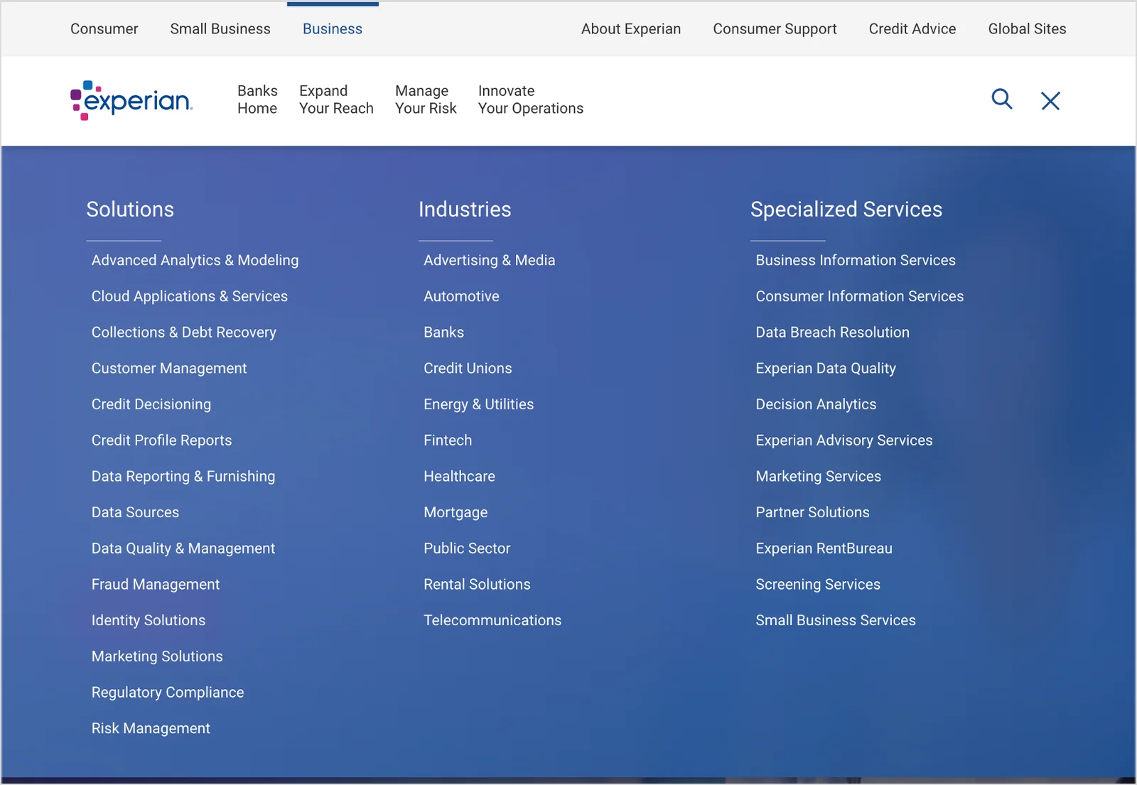
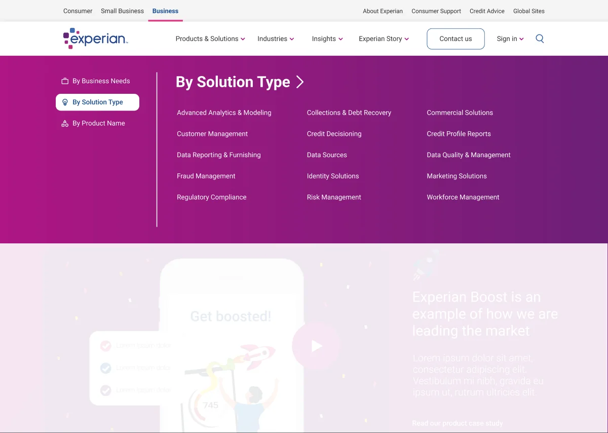
The business site had grown one section at a time. Automotive, Health and other business units each ran their own local menu under a global bar, a hamburger menu held a third copy of the site map, and nothing tied it all together. A discovery team audited the menus and breadcrumbs in March 2024. A new AEM mega nav component was coming, and we needed evidence before building on it.
Before2024 · hamburger menu
At ExperianProject DaVinci · Oct 2024
What 16 people did with it
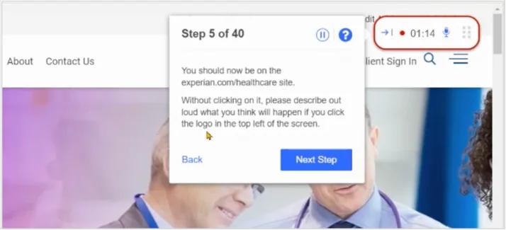
In August 2024 I ran moderated and unmoderated sessions through UserTesting with 10 US professionals at companies of 51 or more employees, plus six Experian employees from marketing, engineering and compliance. Each 20 to 30 minute session had 24 tasks. A website survey added customer feedback. I presented the results to Experian’s AEM Design Governance Committee in September, then wrote the test plan for the next round.
- The global links worked. Nearly everyone moved between Consumer, Small Business and Business, and used the Automotive menu to reach the dealer section.
- The hamburger menu confused most people. They expected account or login options there, not a second site map, and ignored it when looking for solutions.
- Logos went different places. The Automotive logo went to the Automotive home and the Health logo to Healthcare, but people expected the Business homepage.
- Long menus hid options. On laptops the Solutions list ran below the fold, so some people never saw Workforce Management.
- Solutions and products blurred. Finding a product was hit or miss across industries.
“You have this navigation bar, then this subset, and now the hamburger opens another one. There is just so much going on.”UserTesting participant 4
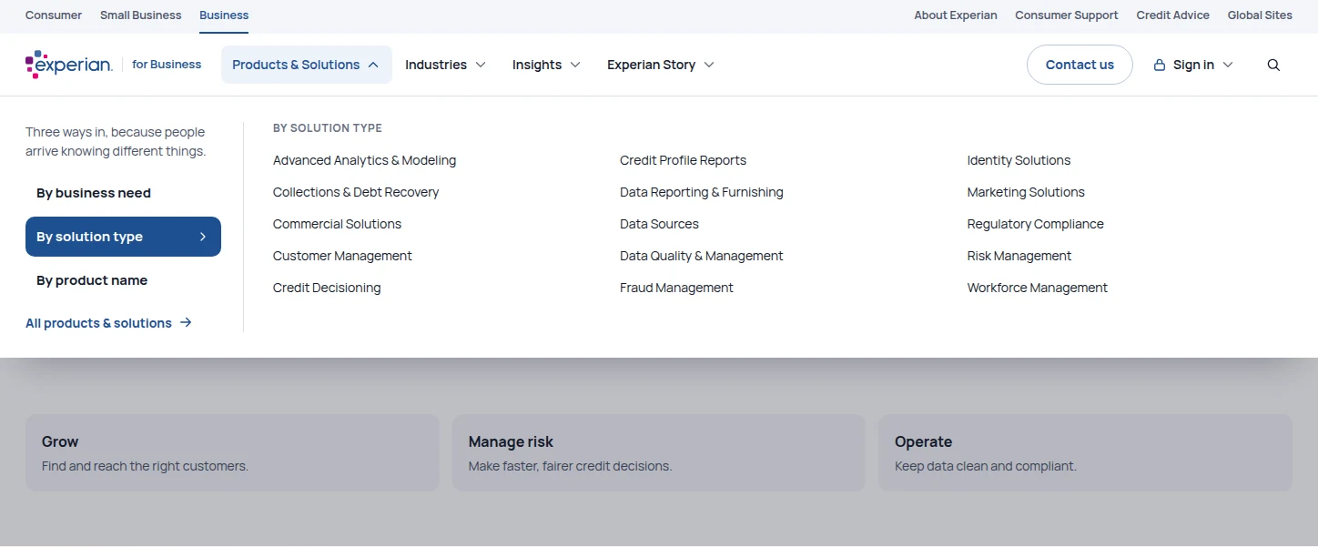
My recommendations: remove the hamburger and move its links into conventional navigation, make the logo behave the same everywhere, break long lists into columns, tighten high-traffic pages, and link products from solution pages. Project DaVinci put them into a design.
Taking it further
DaVinci works best when you use it, so it’s the prototype at the end of this page.
- No hamburger, one bar. Five clear items, with Contact us and Sign in as actions on the right.
- Three ways into products. By business need, by solution type or by name, because people arrive knowing different things.
- Sign in gets its own menu. Participants looked for login in the hamburger; now it’s the first place they look.
- Built as a disclosure menu. Buttons, not hover traps: it works by keyboard, closes on Escape, and becomes a drill-down drawer on phones.
Forty-two portals behind one link.
Business clients reach their Experian products through a single Client Sign In link. Behind it sat a modal that covered the page, split the portals across four pages, grouped them in ways clients didn’t recognize, and still listed discontinued products. Several versions of it lived on different parts of the site.
Before2022 · modal, 4 pages
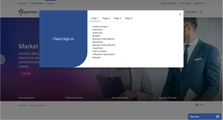
At ExperianShipped design · 2023
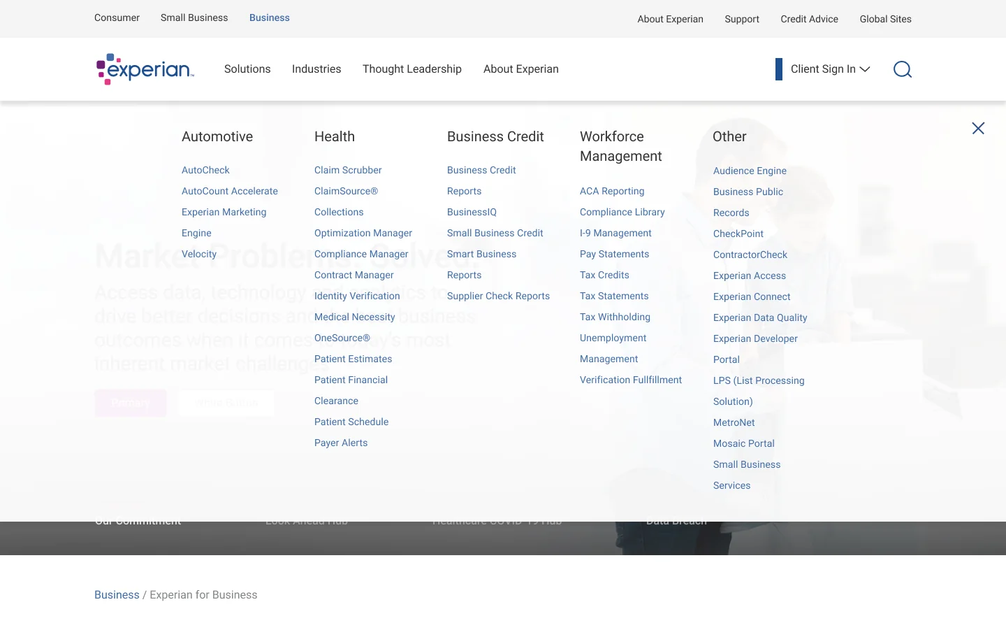
Why it mattered
Our SEO team found that “experian login” draws 370,000 to 380,000 US searches a month, second only to “experian” itself. Search results mixed consumer and business login pages under titles that gave no hint which was which, so people landed in the wrong application.
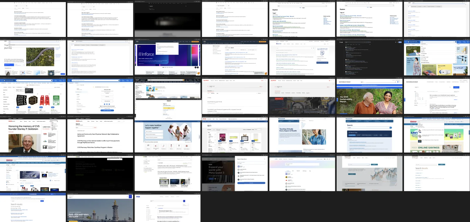
People also typed “sign in” into the site’s own search and got a webinar called “Signs you need to adjust your decisioning model.” In 2024 I audited how 38 large sites handle login searches, from Microsoft and IBM to Amazon, Costco, CVS and JPMorgan Chase, and explored ways to route people from search to sign-in.
Taking it further
Try it: type a product, or “biq”.
Sign in to your Experian product
42 client portals, grouped by business unit.
Business Credit5
Health12
Workforce Management9
No portal matches “”. Check the product name on your contract, or contact client support.
Checking your own credit? Personal reports and scores live on Experian’s consumer site.
New to Experian? Talk to our team
- Find, don’t scan. Filtering as you type, including the names people really type, like “biq” for BusinessIQ.
- A group with a name. “Other” held 12 portals. It is now “Data & marketing”, which says what is inside.
- A way out for consumers. Many people searching “experian login” want their own credit report, so the menu points them there.
- Room to click. 36px rows, visible focus, arrow keys through the list, and an empty state that says what to try next.
A component marketers had stopped using.
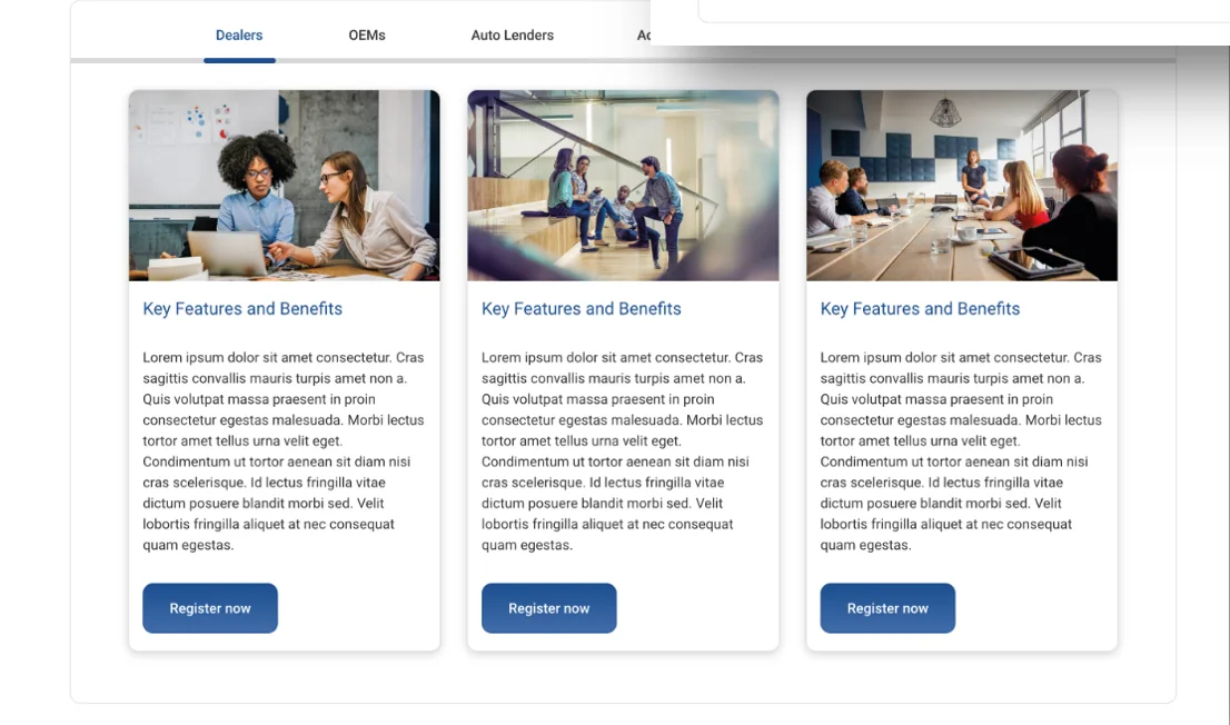
Tabs let authors fit images, copy and links for several audiences into one compact block. Almost nobody used it. When I looked at why, the answers were in the component itself: it looked dated next to newer brand work, copy and buttons drifted out of line across columns, some layouts looked clumsy, and adding content to an existing tab was hard.
Before2023 · original
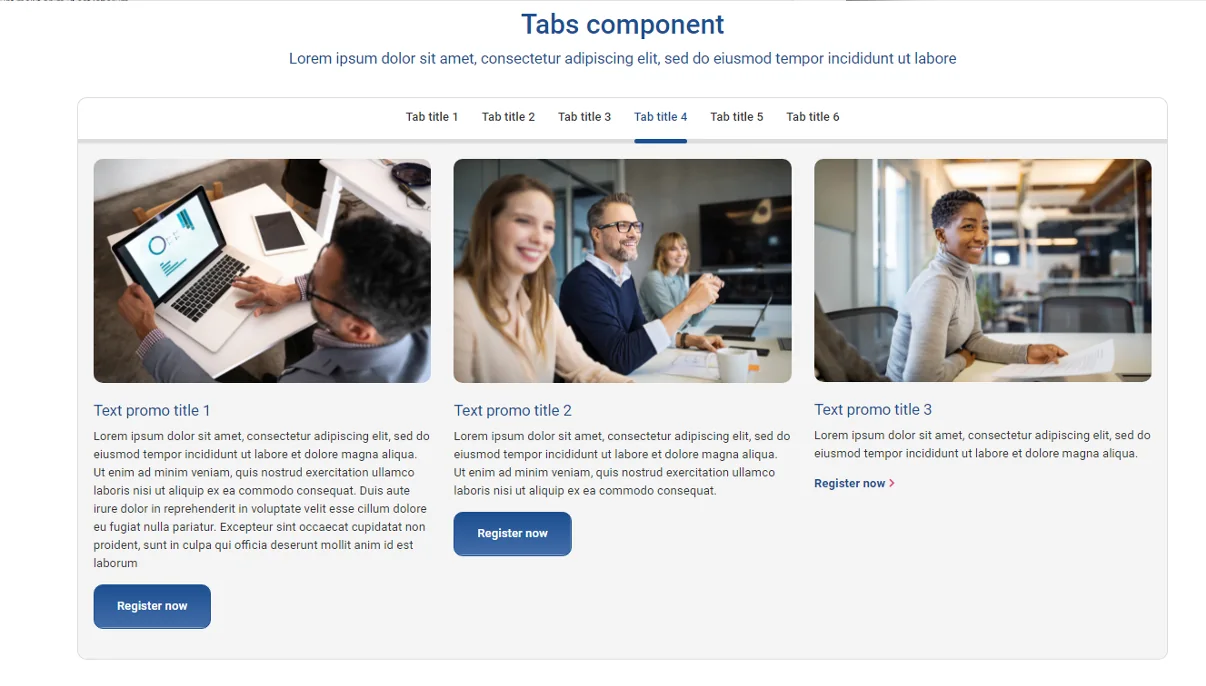
At ExperianShipped design · 2024
What the redesign had to do
- Give authors layouts. Full width, two-thirds with one-third, and three equal columns.
- Match the current brand. Rounded corners, updated colors and a better mobile version.
- Keep images consistent. Fixed ratios, so one tall photo no longer breaks a row.
- Align content automatically. Titles, text and buttons line up across columns without authors fixing it by hand.
Taking it further
Switch the layout the way an author would, and try the tabs with your arrow keys.
AutoCheck for every part of the auto market
Vehicle history data, packaged for the way each partner works.

Vehicle history at the point of sale
Share a vehicle history report with every shopper, on the lot or online.
- Appraise trade-ins with confidence
- Stock what sells nearby

Appraise trade-ins with confidence
Check title, accident and ownership records before you make an offer.
- Vehicle history at the point of sale
- Stock what sells nearby

Stock what sells nearby
Plan inventory with registration trends for your market.
- Vehicle history at the point of sale
- Appraise trade-ins with confidence

See who buys your vehicles
Understand owners and loyalty across models and regions.
- Measure dealer performance
- Plan launches with market data

Measure dealer performance
Compare sales and share across your dealer network.
- See who buys your vehicles
- Plan launches with market data

Plan launches with market data
Size segments before a new model reaches showrooms.
- See who buys your vehicles
- Measure dealer performance

Check collateral before you fund
Confirm the vehicle history behind every loan application.
- Watch risk across the portfolio
- Reach qualified borrowers

Watch risk across the portfolio
Spot changes in collateral value before they become losses.
- Check collateral before you fund
- Reach qualified borrowers

Reach qualified borrowers
Find shoppers who match your lending criteria.
- Check collateral before you fund
- Watch risk across the portfolio

Find in-market shoppers
Build audiences from real vehicle ownership and intent.
- Connect ads to sales
- Plan media by region

Connect ads to sales
Measure which campaigns led to a vehicle purchase.
- Find in-market shoppers
- Plan media by region

Plan media by region
Put spend where the right vehicles are selling.
- Find in-market shoppers
- Connect ads to sales

Know the vehicles near you
See which makes and model years are on local roads.
- Target owners by vehicle age
- Plan parts inventory

Target owners by vehicle age
Reach drivers when their service needs change.
- Know the vehicles near you
- Plan parts inventory

Plan parts inventory
Stock for the vehicles your customers actually drive.
- Know the vehicles near you
- Target owners by vehicle age
- Tabs that look like a choice. A segmented control with a sliding indicator, instead of a thin underline that was easy to miss.
- One grid for every card. Buttons sit at the bottom of every card, whatever the copy length.
- Layouts that still say everything. In full width, the other two cards become a list, so no content disappears.
- Phones and keyboards. The tab bar scrolls sideways with a fade on small screens, and arrow keys move between tabs.
The test came first: two columns won.
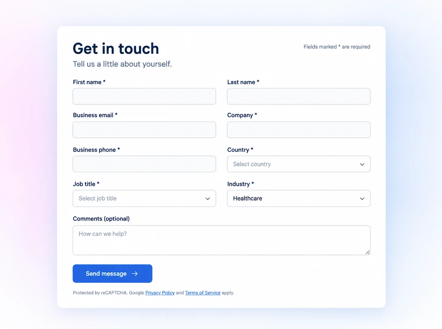
The Health team wanted more quality leads from their contact forms, so they A/B tested a one-column form against a two-column form with the same copy. Two columns won clearly. My job was to turn that result into a form every business unit could use.
Health team A/B test, contact form
| Version | Visitors | Completed | Rate | Lift |
|---|---|---|---|---|
| Two columns | 1,630 | 58 | 3.6% | +68.2% |
| One column (control) | 1,607 | 34 | 2.1% | — |
Confidence 97.7%, as reported by the test tool. Rates are completions divided by visitors.
Designing for every form, not one
A two-column form is easy for six fields and hard for twenty. I designed for the cases authors would actually build: fields ordered for Z-shaped scanning, mixed field types, long text, conditional fields, labels, validation and odd numbers of fields. I added a gradient background option and a wider form that cuts scrolling.
Taking it further
Try sending it empty, choose Healthcare as the industry, or use a personal email address.
Let’s power opportunities together.
Tell us what you’re working on and the right specialist will get back to you.
- Takes about a minute
- Routed by industry, not a shared inbox
Thanks, .
Your note is with our team. This is a demo, so nothing was sent.
- Labels that stay. The shipped form used placeholders as labels, which vanish as you type. Every field now has a visible label.
- Errors at the right time. Fields check themselves when you leave them, and a summary on submit links to each problem.
- A nudge, not a wall. A personal email gets a gentle hint instead of an error.
- No holes in the grid. Conditional and long fields span both columns, and the form drops to one column on phones.
A dead end that should point somewhere.
The business site’s 404 page had a photo, a search box and nothing else. Working with a content strategist, I looked at the analytics and at best-in-class 404 pages from Google, Apple and others.
Before2023 · original
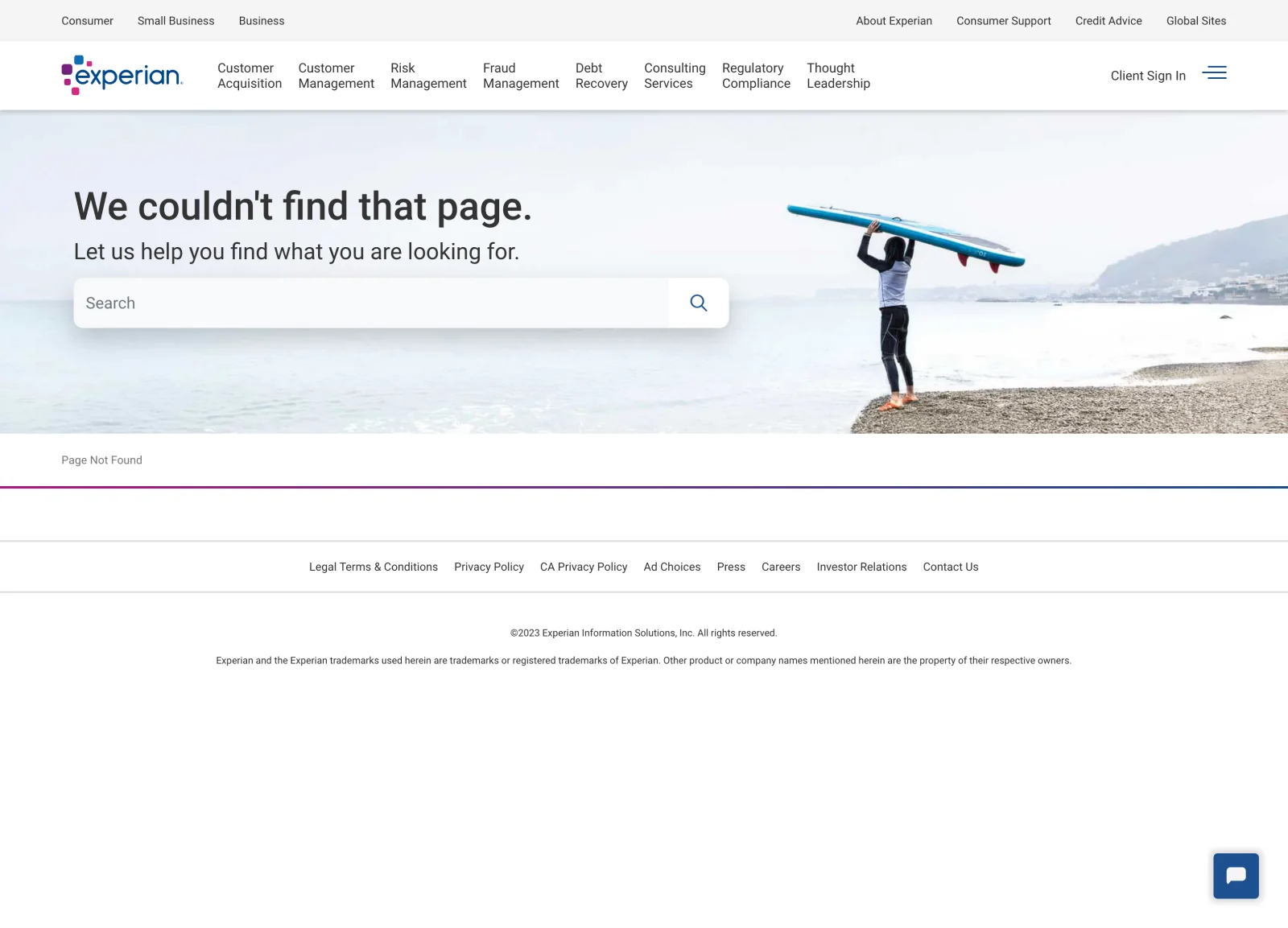
At ExperianRedesign · Sep 2023
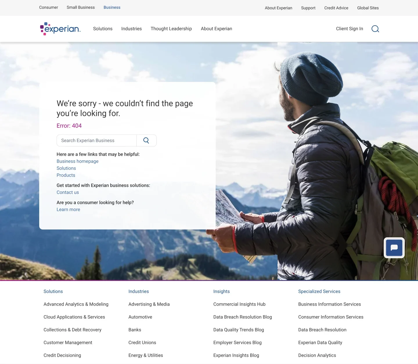
What the data said
4,749visits to the 404 page in the period we pulled
265of them used its search, about 5.6%
Search, the only way out, was barely used. We also suspected many visitors were looking for consumer or investor content and had landed on the business site by mistake. So the plan was to keep a smaller search, add a few neutral links (products, solutions, client sign-in, about) and point consumers to the right site.
Taking it further
Try a popular search, or pick a door.
404 Page not found
That link didn’t lead anywhere.
The page may have moved or been renamed. Pick the Experian you meant, or search below.
Business solutions
You’re here. Products, industries and research for organizations.
Browse solutionsPersonal credit
Your credit report, score and identity protection.
Go to experian.comInvestors & careers
Results, reports and jobs at Experian plc.
Go to experianplc.com
- “Which Experian did you mean?” comes first. Three doors for business, personal credit and investors answer the mistake we suspected most.
- Search second, with suggestions. It stays for the 5% who use it, with popular searches that save typing.
- Words that own the error. “That link didn’t lead anywhere” instead of an apology and an error code.
- Still a way to a person. The four neutral links and chat close the page.
Components are products, and they need research too.
Test the chrome, not just the pages.
Nobody had tested the navigation because it felt like plumbing. Twenty minutes with real users settled debates that months of audits hadn’t.
Design for the author.
A component is only done when a marketer on another team can configure it correctly without calling a designer.
Use the numbers you have.
Search analytics, SEO data and an A/B test were already sitting with other teams. Asking for them made the case for every change.
Revisit your own work.
Rebuilding these in code showed me what I would push harder on today: accessibility, real states, and fewer places where a user has to guess.
Try the navigation and sign-in yourself.
This is Project DaVinci with the new sign-in menu inside it. Browse products three ways, find an industry, sign in to a portal, then switch to a phone and do it again. It’s a clickable prototype; nothing leaves this page.
 for Business
Sign in to your Experian product
42 client portals, grouped by business unit.
Business Credit5
Health12
Workforce Management9
No portal matches “”. Check the product name on your contract, or contact client support.
Checking your own credit? Personal reports and scores live on Experian’s consumer site.
New to Experian? Talk to our team
Popular: Fraud management · Credit decisioning · AutoCheck