Direct Share
Simple, secure file sharing with people outside the organization, on any screen.
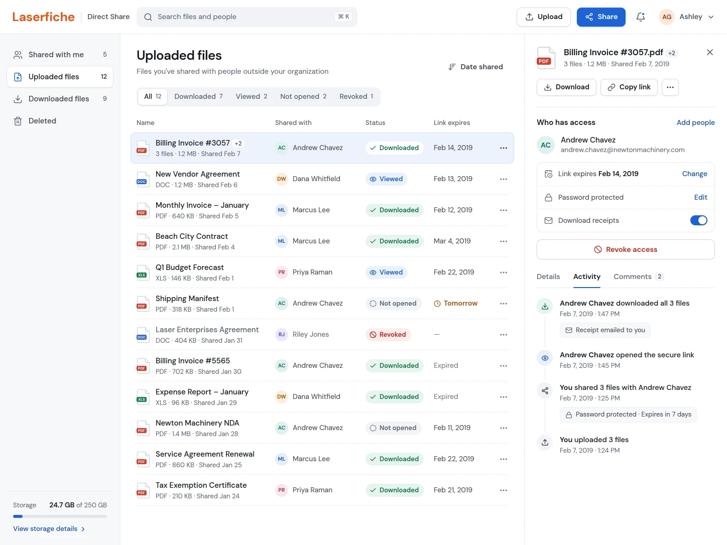
Laserfiche customers needed a modern way to share files outside their organizations without giving up security.
The old experience was confusing, worked only through email, and lacked features customers already expected from Dropbox and Google Drive. I owned the UX from discovery through launch, working with product and engineering to define an MVP we could ship and a longer-term vision to grow into.
Security had turned every document into an island.
For at least four years, customers had asked for an easier way to share files outside their organizations. Many were government agencies, cities, and school districts. Their documents were safe inside the Laserfiche repository, but getting them out was cumbersome and hard to audit.
One city councilman needed to send a document to the mayor of another city and couldn't tell whether the process was secure. His IT manager had a worry of his own: employees emailing files with no electronic audit trail, or turning to unvetted tools like Dropbox.
Users worried that notification links looked like phishing, that they couldn't revoke access, and that they had no reliable way to know whether a recipient had viewed or downloaded a file. IT teams had no oversight, and more people were turning to unapproved third-party tools.
Six recurring pain points set the product roadmap.
Working with Laserfiche's consulting and customer service teams, I gathered and analyzed user data, reviewed competing products, and tested priorities with customers.
Products reviewed6
- Egnyte
- Google Drive
- Dropbox
- Box
- OnBase by Hyland
- WeTransfer
Expectations that kept coming up5
- Branding for each organization
- Strong security
- Links that work in any email or chat tool
- Document signatures
- Robust search and filtering
The same expectations kept coming up: branding for each organization, strong security, links that could be shared through any email or chat tool, document signatures, and robust search and filtering. I vetted each idea with customers before we prioritized it.
- Users couldn't tell whether they were sharing securely or breaking IT policy.
- Senders couldn't revoke access or see whether files had been downloaded.
- Recipients had no easy way to collaborate on a shared document.
- Duplicate files were everywhere, and people worried documents would go missing.
- Teams needed read-only sharing that didn't force a download.
- Administrators needed visibility into sharing across the organization.
I brought these findings to weekly meetings with the product manager, where we wrote requirements together and focused our solutions on the most critical problems.
Replace one overloaded screen with a guided decision.
Laserfiche's legacy "email basket" packed every option onto one confusing screen. Even engineers inside the company admitted they were afraid of picking the wrong one, and users often had to guess what a control did or look it up in the documentation. Over more than a dozen iterations, informed by competitive analysis, user surveys, and usability testing, I separated the sharing methods, removed low-value options, and showed advanced controls like expiration and passwords only when they were needed.
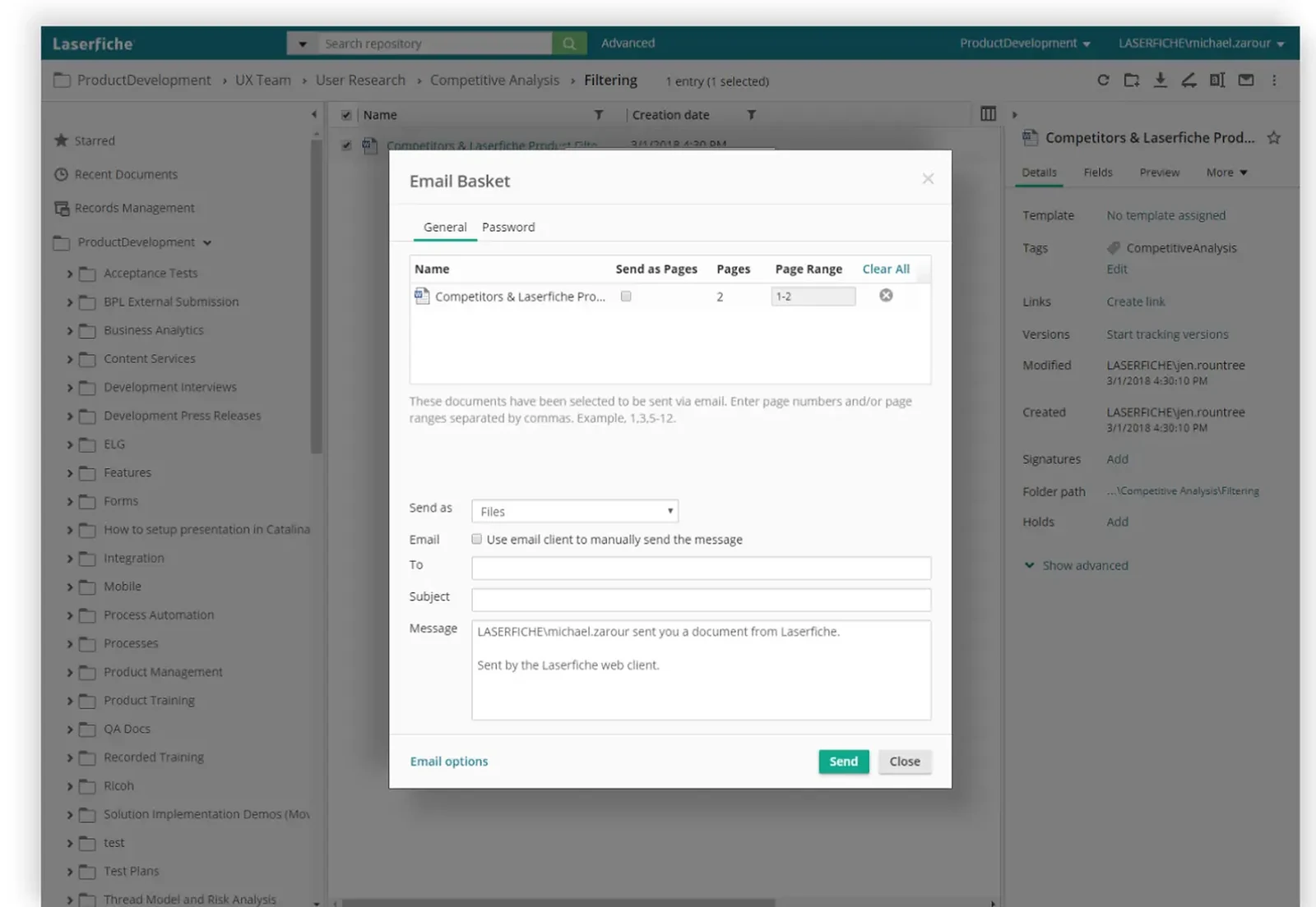
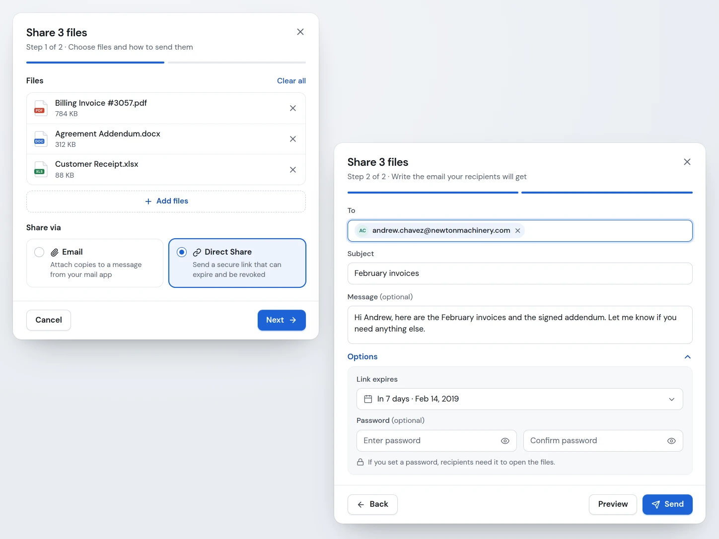
- 01The task is split across steps
Nothing is crammed onto one screen anymore. Users choose Email or Direct Share first, then continue.
- 02Far fewer options to choose from
I removed low-value options based on competitive research and Laserfiche consulting data on the features customers used most.
- 03Simple fields to fill out
The compose step uses familiar To, Subject, and optional Message fields.
- 04Options hides the advanced controls
Expiration and password settings stay out of the way until someone needs them.
- 05Useful defaults reduce effort
Shares default to seven days with no password, and users can change either setting.
Make every status clear to both sides of the share.
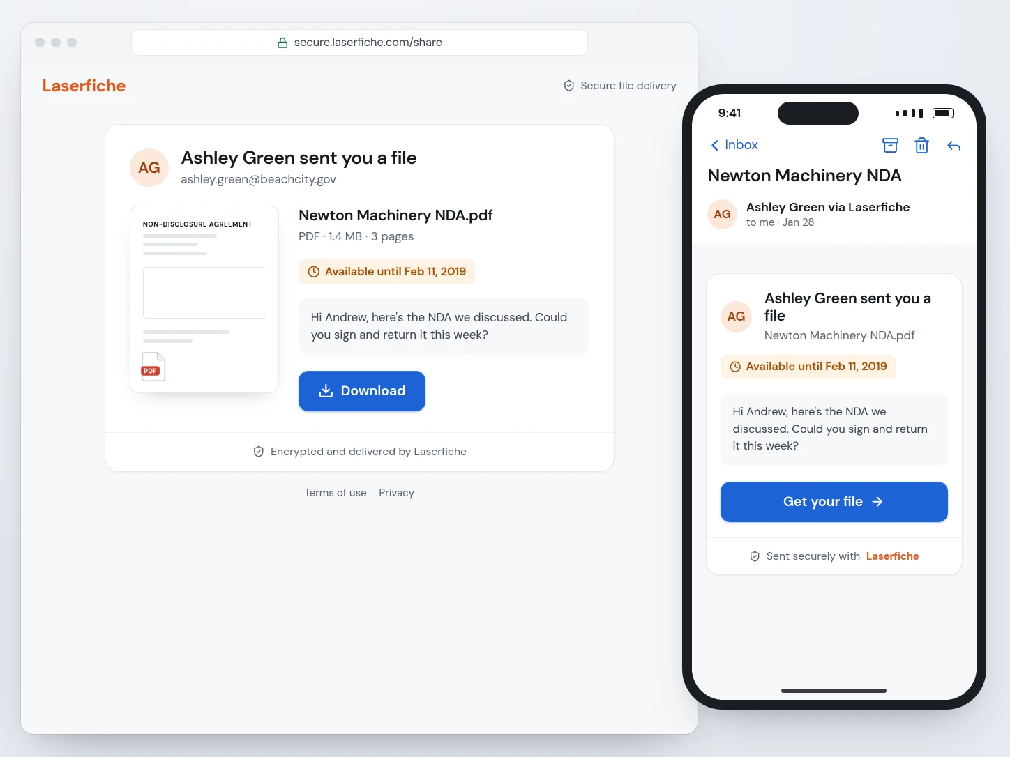
I redesigned the notifications so recipients, including people who had never heard of Laserfiche, could recognize the source, see who sent the files, and get to the download quickly without mistaking the email for spam or phishing. Senders got confirmations and download receipts, with direct links to revoke a share or change its expiration date. Competitive research and usability testing shaped each iteration.
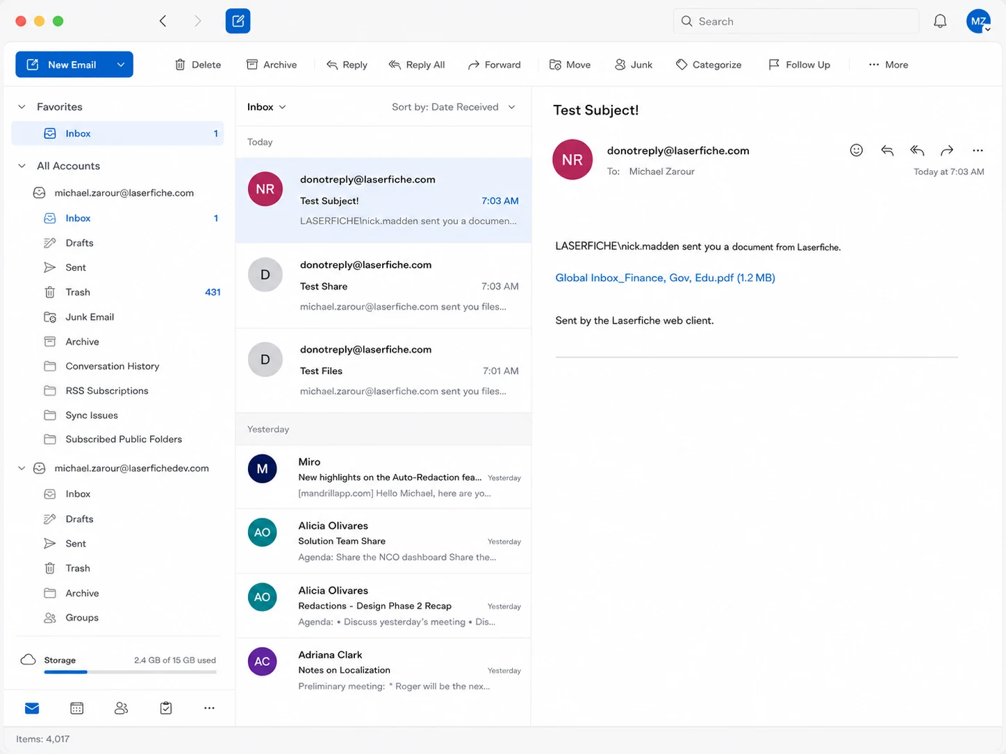
- 01Text-only message
The original email did little to explain the experience or earn trust.
- 02Link users were suspicious of
Recipients said the raw file link was often mistaken for spam or phishing.
- 03No Laserfiche branding
Without a recognizable identity, recipients had no reason to trust where the email came from.
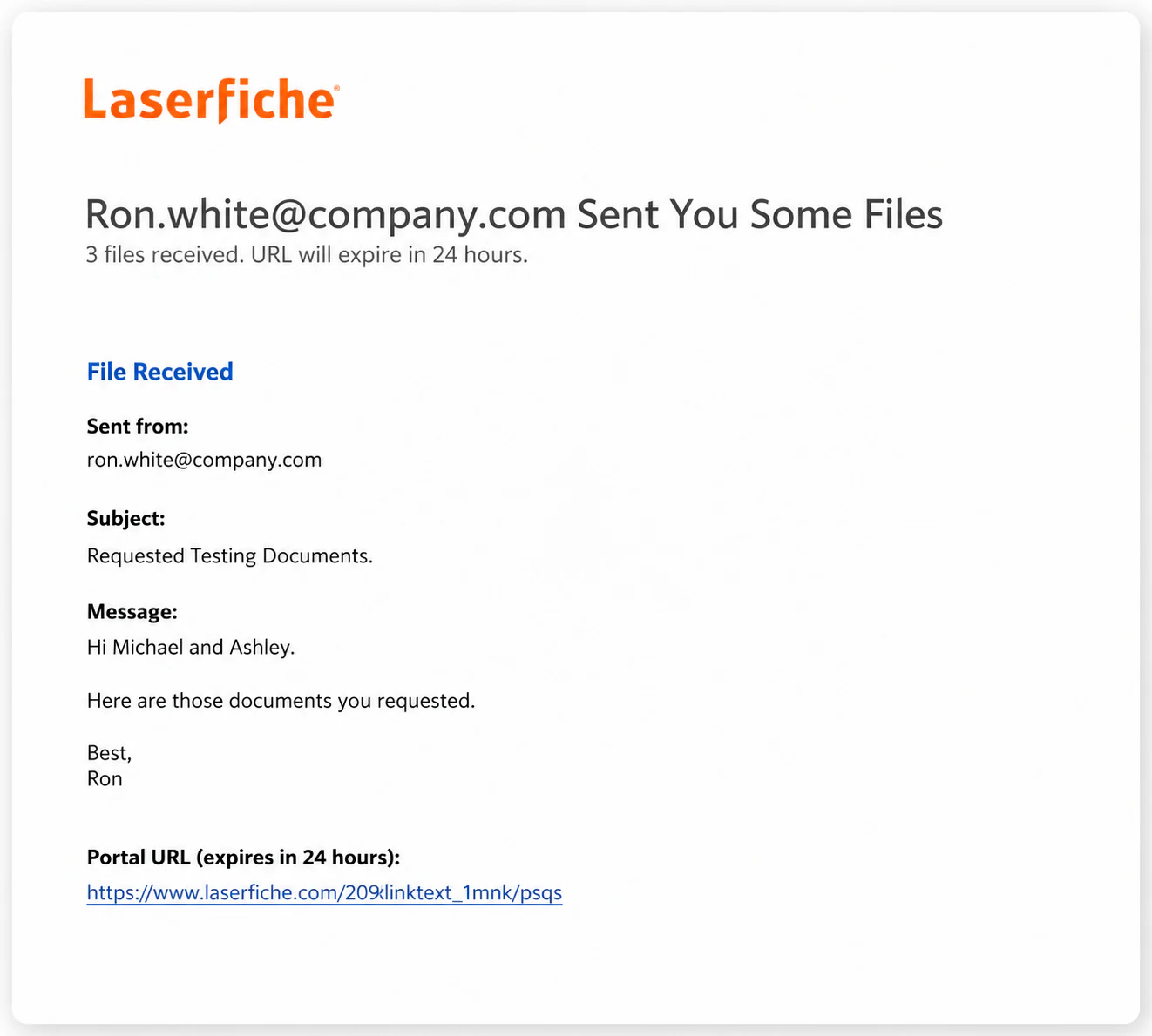
- 01Laserfiche branding
Customers felt the branding was too strong. They just wanted to get to their files.
- 02More stylized typography
The message was still wordy: “sent” or “received” appeared four times.
- 03File link was easy to miss
The link to the shared files was still small and buried at the bottom.
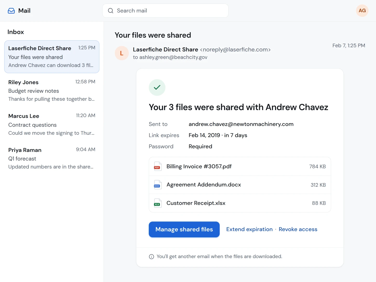
Email to the sender confirming their files were sent
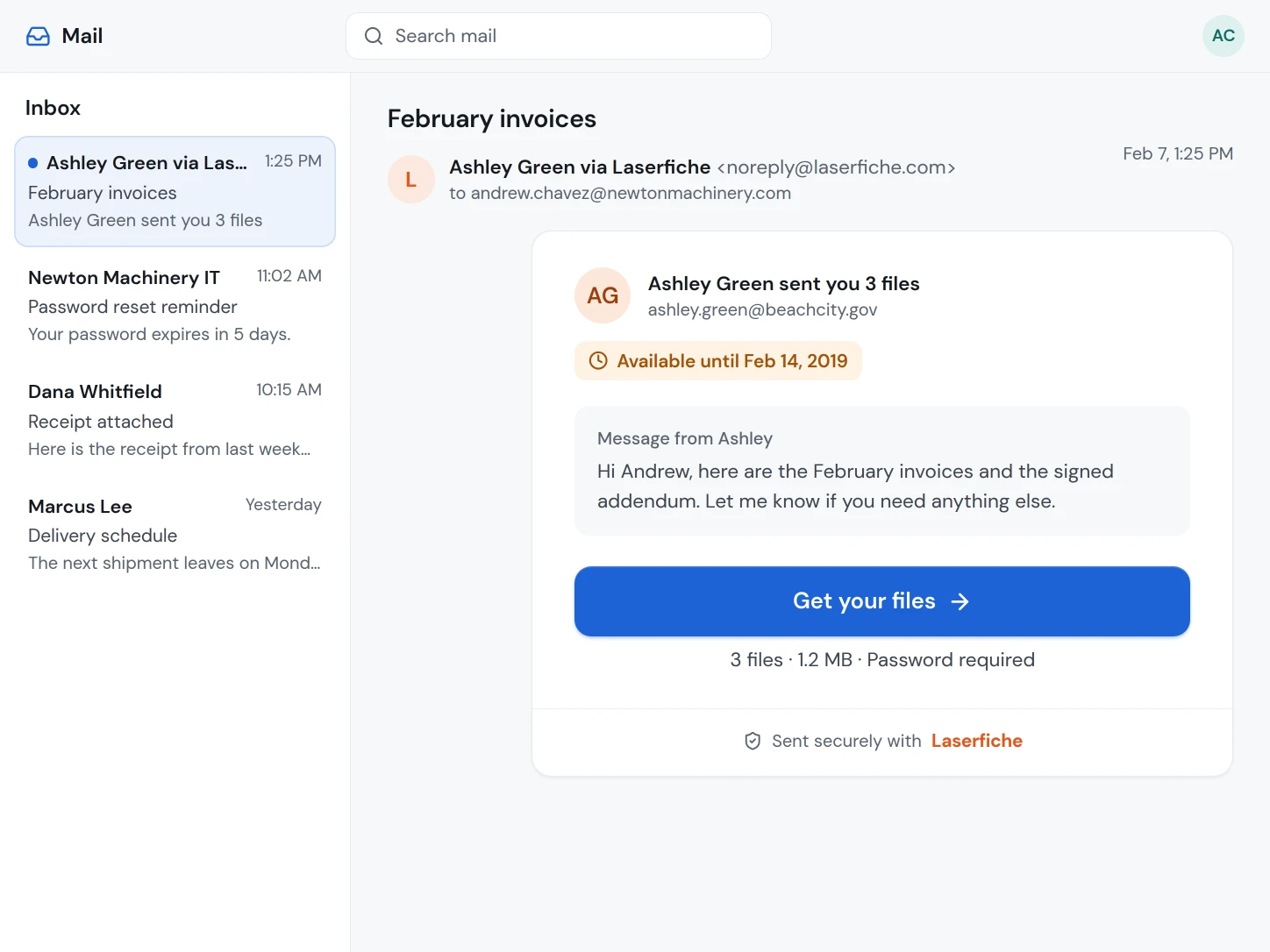
Email to the recipient so they can download the files
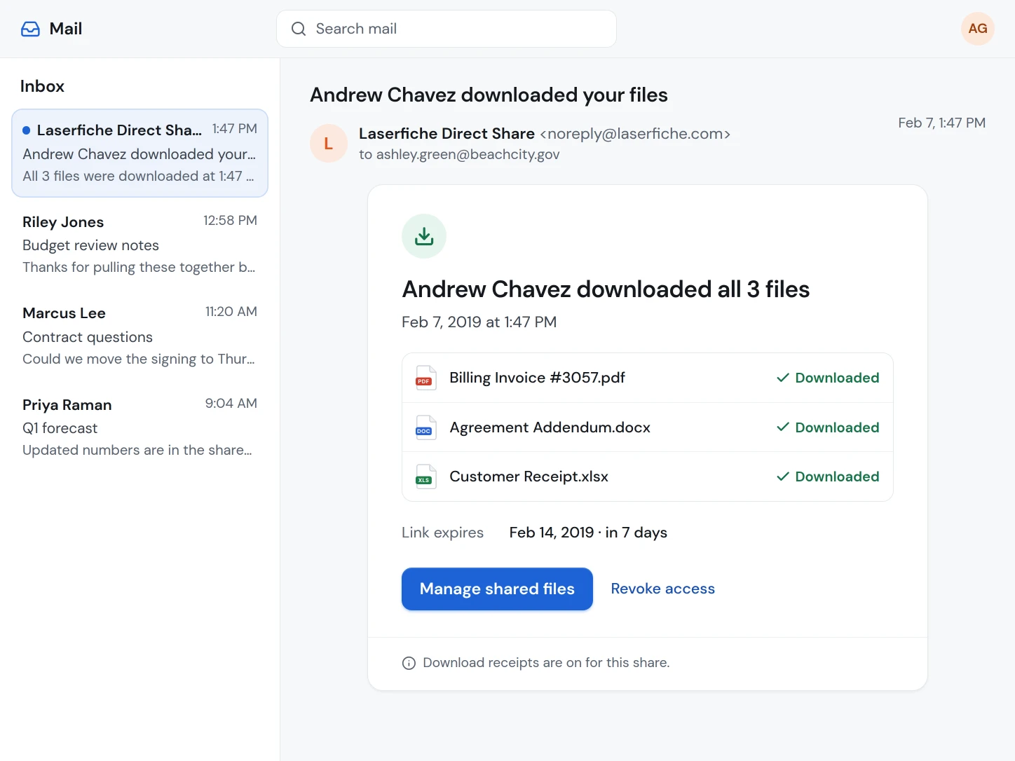
Email to the sender confirming their files were downloaded
- 01Manage the share after sending
The sender can revoke the files or extend the expiration date right from the confirmation email.
- 02A simple message, no repetition
The recipient sees who sent the files, when they expire, and one short explanation of what to do next.
- 03A large button to get the files
The main action is prominent and easy to find, not a small raw link near the bottom.
- 04Subtle Laserfiche branding
Restrained branding builds trust without getting in the way of people who just want their files.
Ship the core journey, then create room to grow.
The full portal vision would have taken too long to build. With the tech lead and product manager, I defined a simpler MVP that kept the most important parts of the vision and could grow over time. Customers had asked repeatedly for responsive and mobile access, so the first release delivered a secure download journey on every screen size while leaving a path to collaboration, signatures, activity history, and administrative controls.
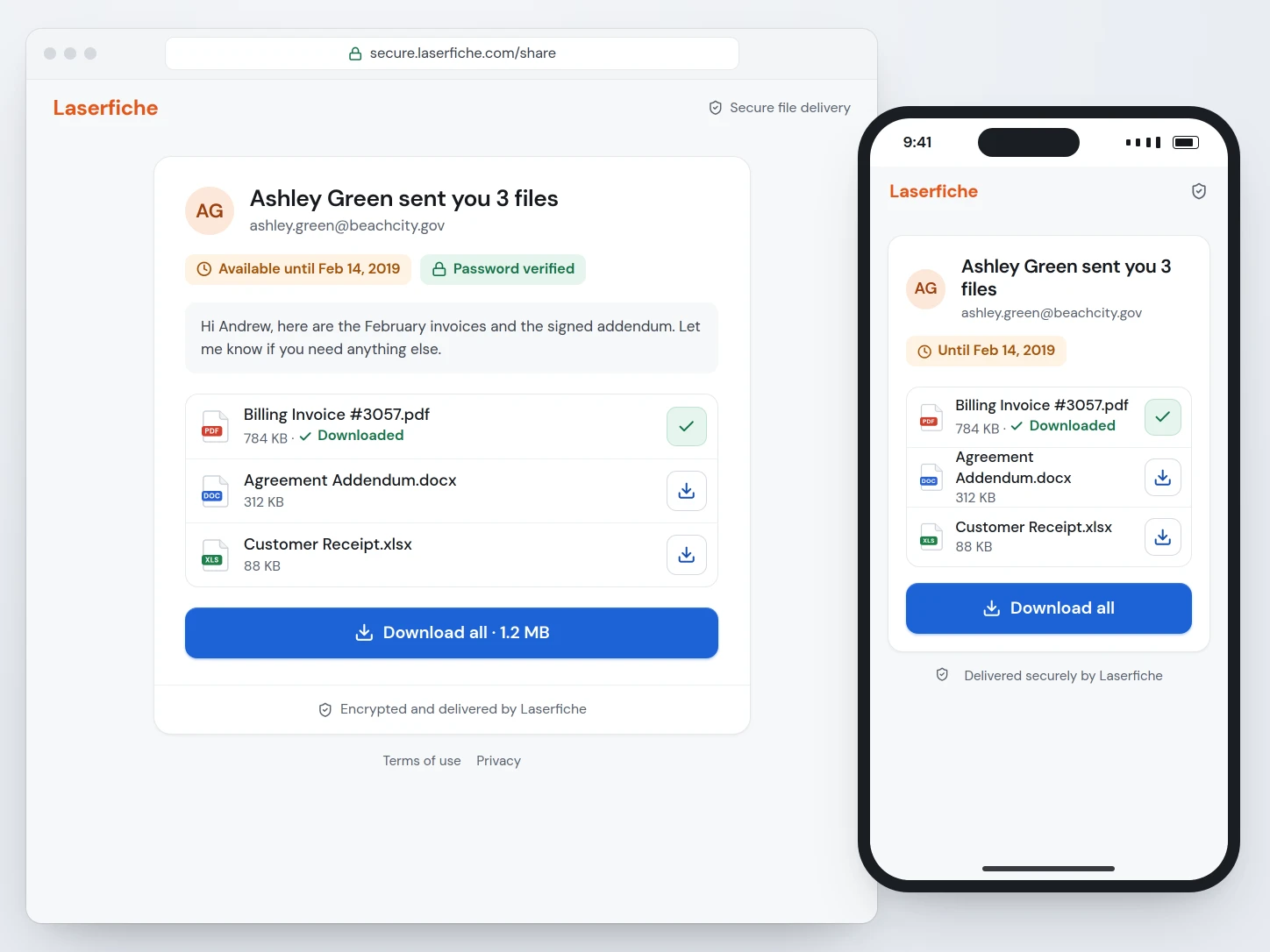
- 01A simple view of what matters most
The sender, expiration, file details, and download actions are easy to scan.
- 02Downloaded state at a glance
The original design showed a green checkmark once a file, or every file, had been downloaded, so recipients could see their progress.
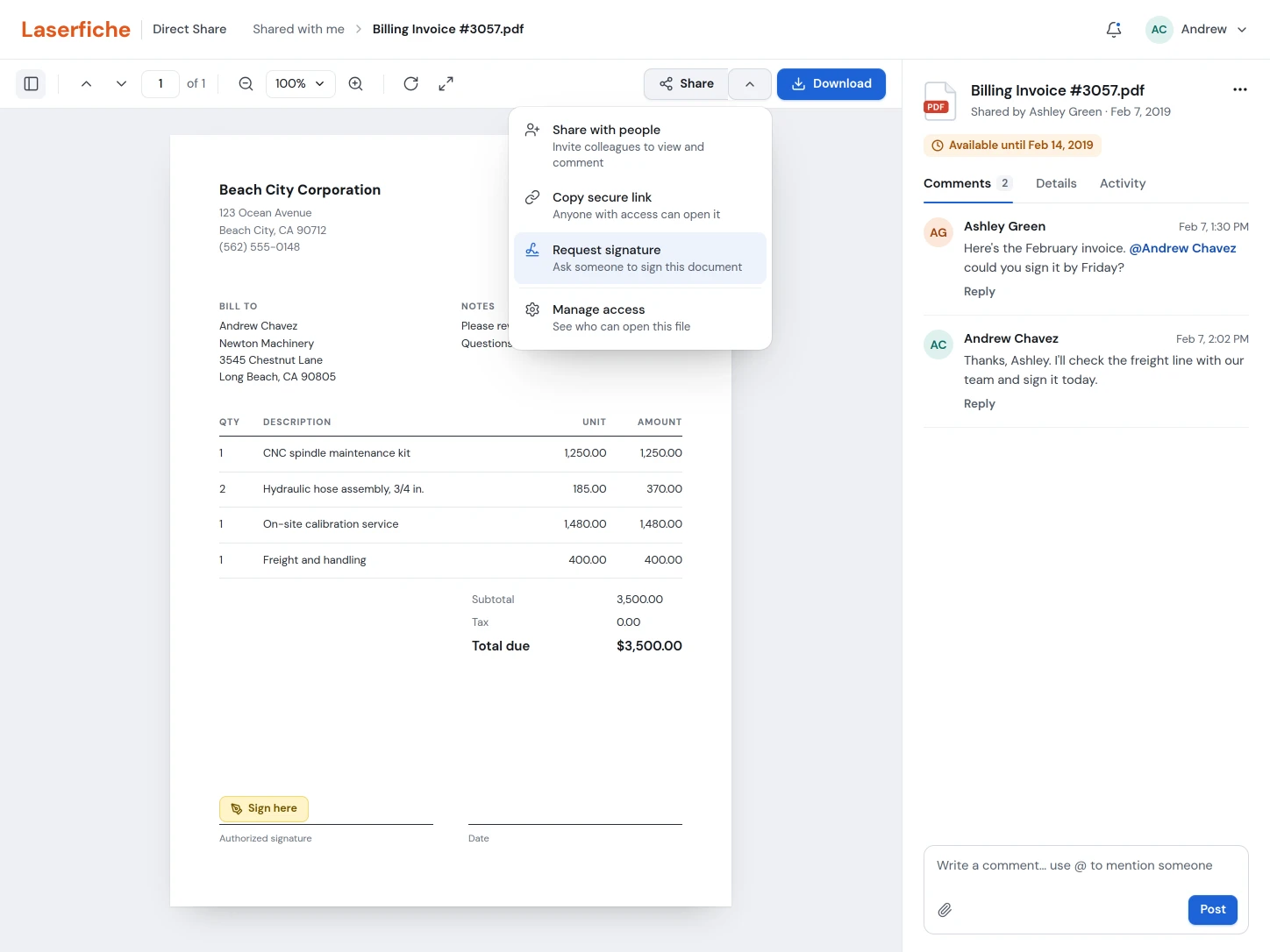
Turn sharing into a workspace people come back to.
In the broader concept, recipients could sign in to view and download shared documents, collaborate with colleagues, request signatures, review activity, and check their notifications securely. Senders could see everything they had shared and revoke access.
Give administrators visibility and control.
Administrators could monitor storage, add capacity, review sharing across the organization, and revoke access when needed. Everyone else could manage their own shares, revoke individual files, or change expiration dates. Testing with customers who were CIOs and IT managers shaped these controls.
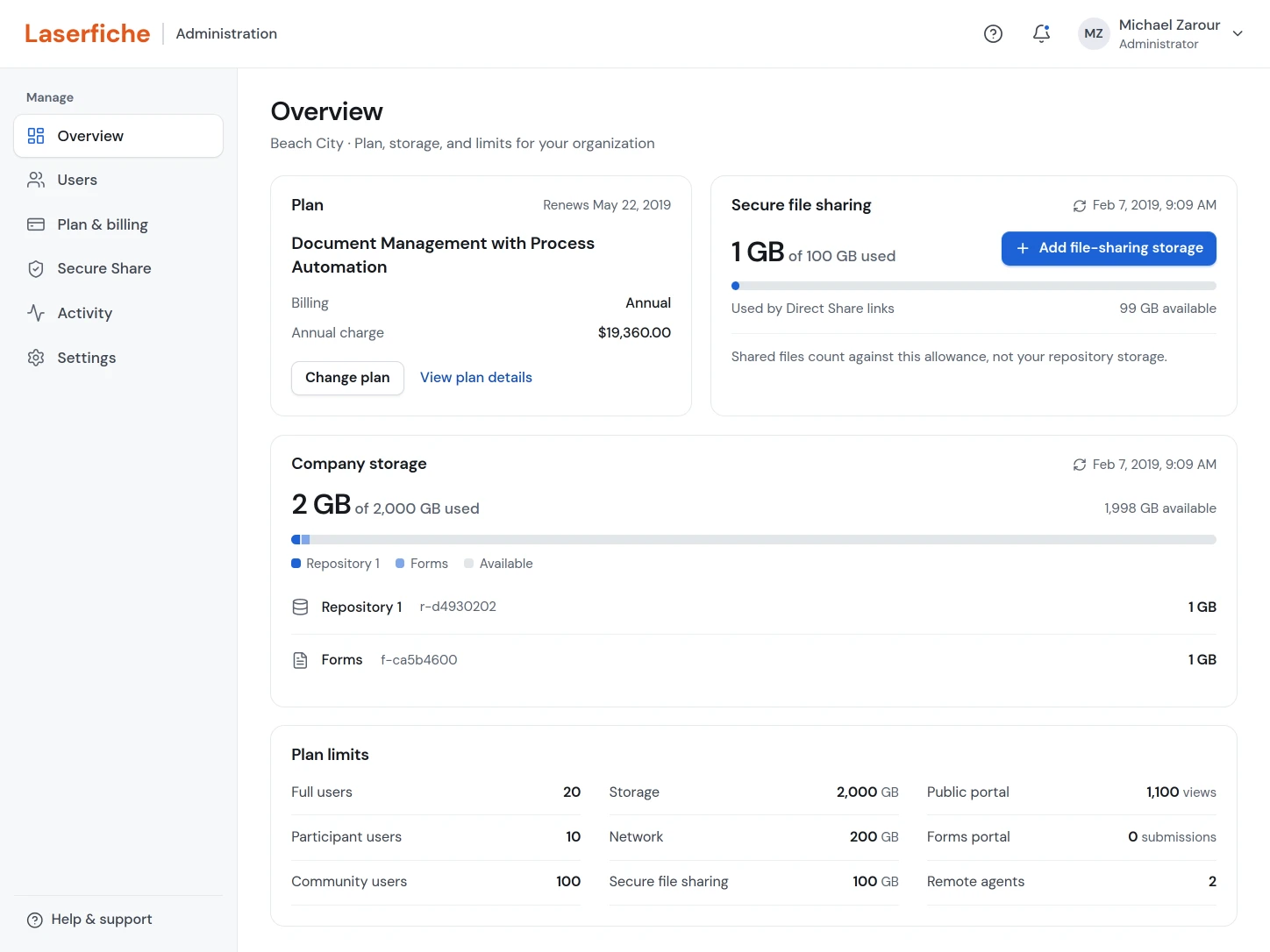
- 01Add more file-sharing storage
Administrators can add cloud file-sharing storage for their company from the plan controls.
- 02Check file-sharing storage usage
A dedicated meter shows how much storage file sharing is using.
- 03Check company-wide storage usage
The total usage bar shows how much cloud storage the company has used.
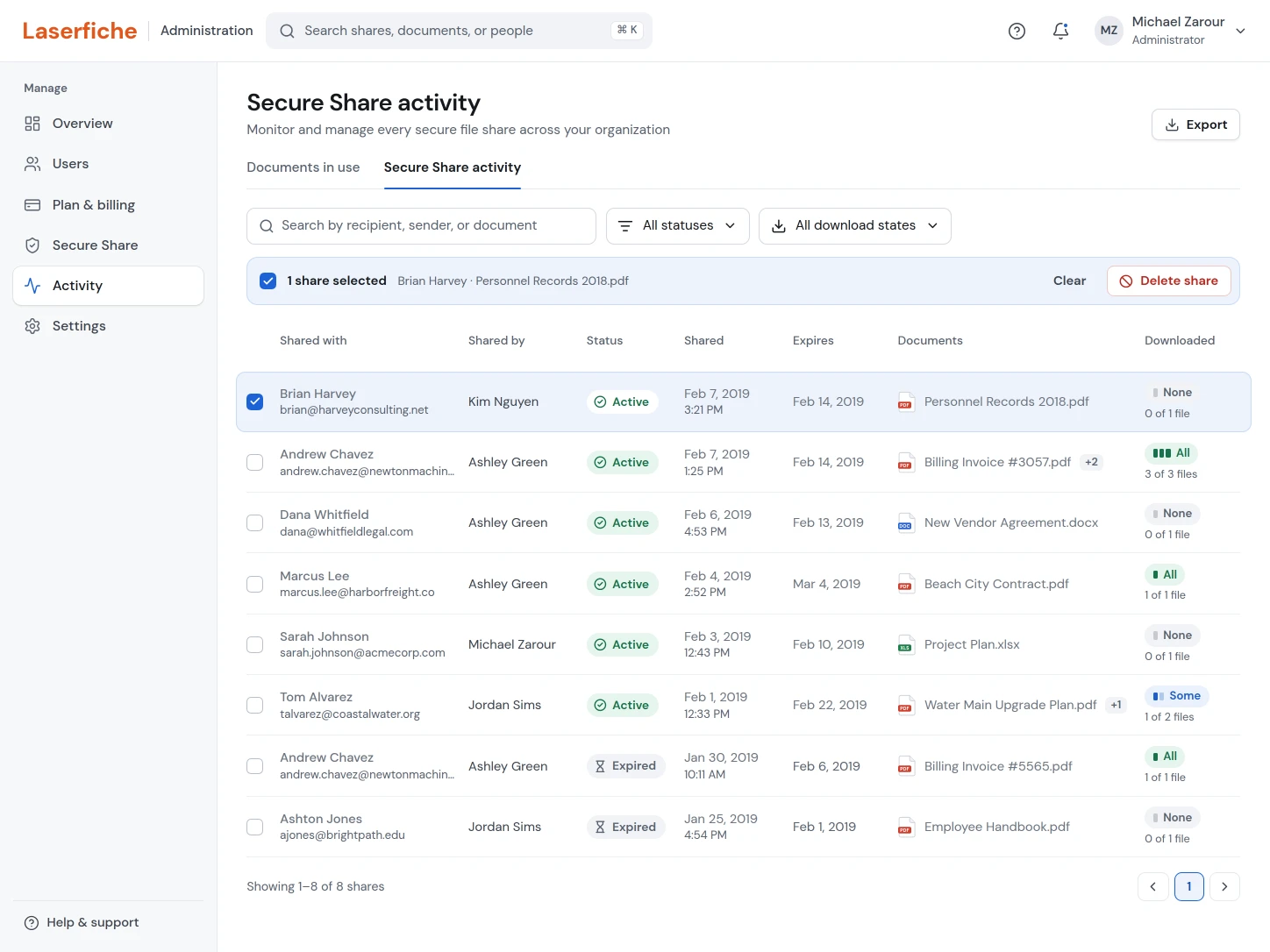
- 01Revoke access when needed
Selecting a share reveals a Delete share action, which revokes access so the recipient can no longer open the portal.
- 02See the download state
Downloads within a share are summarized as None, Some, or All.
The research didn't stop at the first release.
I used in-person and online research to find and fix points of confusion. At Empower 2019 in Long Beach, while Direct Share was still early, I surveyed customers interested in file sharing about the features that mattered most to them and ran usability sessions at the UX booth.
By Empower 2020, the first version had shipped and was presented to more than four thousand Laserfiche customers. I kept researching both Direct Share and the Laserfiche repository and used what I learned to refine the sharing and repository workflows.
In customer surveys, repository user satisfaction rose from 77% to 92%. The stronger sharing story also helped Laserfiche compete for security-conscious organizations, including school districts and government agencies that had previously held back.

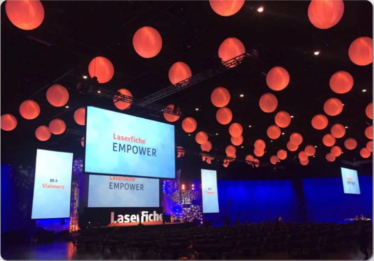
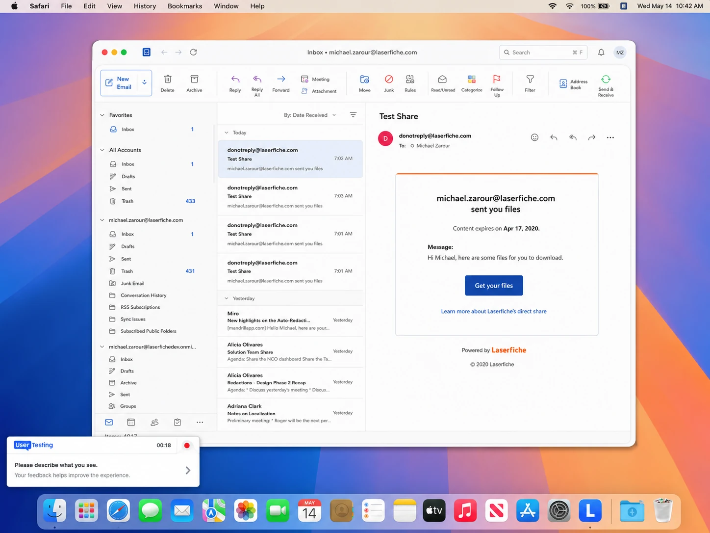
- 01Feedback captured through UserTesting.com
Participants worked through the real experience and described what they saw, so research could continue between conferences.
Good product design is also knowing what can ship.
Adapt to change.
Requirements changed quickly, especially before conference deadlines, so clear priorities mattered as much as polished screens.
Fight for good UX.
Technical constraints pushed some features to a later release, but the MVP still had to feel coherent, useful, and trustworthy.
Choose what not to build.
Resources were limited, so costly or unrealistic features waited for later rather than weakening the first release.
Define the right MVP.
I learned the difference between a focused, useful product that can ship and an MVP so thin it becomes unusable or never ships. A credible long-term vision kept those tradeoffs grounded.
Try the whole share loop yourself.
Share the February invoices as Ashley. Then switch to the recipient, open the email, and download from the secure portal. Back as Ashley, check the status, activity, and receipt, and change the expiration or revoke access. It's a clickable prototype of the flows above, and nothing you type leaves this page.